
Traditional art
- Amber Boys
- May 20, 2024
- 10 min read

Updated: Jun 7, 2024
Some of my traditional illustrations
Drawn with blue ball point pen and a white gel pen. I made this picture as a gift for my friends birthday. It is a more stylised drawing of her dog.


First half (Dads van cover)
For this project I need to:
• finish this in time for hand in.
• finish to a high standard in the time give.
• make sure it's exactly what the client wants. (give room for suggestions but ultimately listen to the client above all else).
As I willl be doing a traditional illustration on wood I also need to understand the challenges that will
Come from that:
• I'm out of practice when it comes to traditional drawing as I'm used to digital drawing.
The texture of the wood will be difficult to draw on in comparison to drawing on my I pad or paper.
• The pics of wood is approximately (enter length)
As it is long it will be hard to move around and I will be forced to prop it up at uncomfortable angles o be able to add the details needed.
Clients.
So originally I thought I would only have one client for this project I now have 2 as my mum shares the van with my dad so she rightfully should have an input into what the design should be.
Mums criteria:
•must match the vibe of the van
•not be to jarring
•as monochromatic as possible, with trim for black accents.
•Don't make it look cheap keep it clean •Can be interacted and detailed but don't make it look like a confusing mess
Dads criteria:
•Encorporte one of his favorite songs.
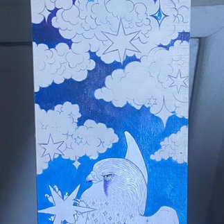
•Have a kestrel
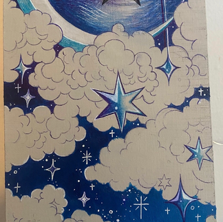
•Have some sort of sky/star motif•be bold
•have good energy
Self made criteria:
•Encorporate negative space
•Be to a professional standerd
•Be good enough to show my skills •don't go overboard with unnecessary details remember that details arnt the end all be all.
•take constructive criticism and use it to improve it is the most important thing to do to improve.
Professional goals.
•Make a strong piece of work for my portfolio•complete a piece of work that the clients are happy with.•Complete work to high professional standard.
•Complete for the deadline.
Personal goals.
•Incorporate something into the illustration that I've never tried before.
•Always ask for critical evaluation from others. That aren't the client as well as the client.• don't be too hard on yourself or overly critical of your own work.
By the end of this project, I hope to have met both my personal goals as well as my clients criteria. My mum and dads criteria will be at the forefront of my mind when creating the illustrationfor this board but I still want to keep in mind my own personal goals for this project.
Durning this project my primary focus will center on these specific elements:
Character design
Aesthetic and clean illustrations and designs
Take into account how drawing on a textured surface could impact the quality of the illustration.
Crafting a well finished board to a professional standard.
I've chosen to engage in this project as my external engagement because having my mum and dad as clients give me easy access to their thoughts and opinions. They can redely give me feedback on my work and ask me to make fast changes if needed as I live in the same house as them. This project gives an avenue to illustrate on something other than my I pad.
Having my mum and dad offers a lot of freedom to ask questions and deep dive into exactlywhat they want. The deadline for this will be the 10th as my mum and dad want my illustration to be completedfor when they go camping in summer. So the deadline is goingto be the hand in deadlin. This project has the potential to earn 8 merits, if I complete the work on time and to a high enough standard. The project consists of 3 large ilsustrations that mix well together. Tey must be illustrated onto a wood plank they will be placed portrate. The purpose of this plank is to cover the seems of the van's previous doors.
So I will be creating a personalized illustration for my parents' camper van draft cover. This will involve a deep dive into their individual preferences, emphasizing the importance of attentive listening to create a truly meaningful piece of art.
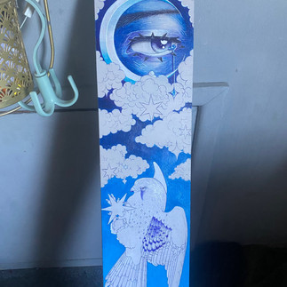
My mums preference for a soothing, monochromatic blue palette with subtle black accents is because she wants it to guava a calming atmosphere for the sleeping area.
The color scheme of the van is blue and white so the design must fit into the color scheme. I will be drawing on directly onto a piece of wood I will first to my design on my iPad so I have structure to follow as I don't want to go straight in on the wood without having a design in mind I will sketch a few concept designs and then let my dad pick which one he thinks it's best.
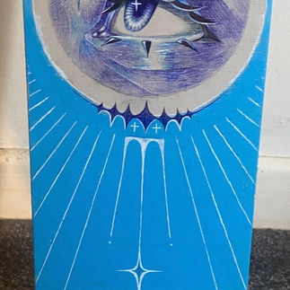
On the other hand, my dads is more sentimental because me and him have an attachment to kestrels because we used to spot them flaying at the sides of the motorway when going on camping trips. So there is a kinda emotional significance to the project to making me want to make the finished product look good for both my mum and dad. My dad also has his affinity for the song "Eye in the Sky" and asked if I could get the vibe of that song into the drawing /painting. The focal point, would be the kestrel as that was his first and most important idea for the project. I did say I would try my best to do exactly what he had in mind so then he gave me the song prompt to and challenge me to translate music into an image.
The decision to incorporate celestial elements, inspired by the song.
The challenge of achieving bold contrasts while maintaining visual harmony becomes a delicate dance between artistic expression and the practicalities of the camper van's interior. This interplay highlights the importance of considering the functional aspects of the artwork—ensuring it not only resonates emotionally but also complements the intended physical space.The process of listening to and understanding the clients—my parents—becomes the cornerstone of this creative plan, emphasizing that a personalized project is not just about meeting aesthetic preferences but about encapsulating exactly what they both want.
They are also both quite hippie dippy and like psychedelic imagery. So i decided to show them examples of other people's work they might like to get a feel of exactly why they want.


Process
and create a more visually interesting composition.


I needed to pain the wood to cover the bumpy texture as well as the stains and peeling.
After painting I propped it up to dry for a few days unfortunately as it was propped against my char I didn't notice that it stared to bow.


To stop combat the curve in the wood I placed it under my heavy mirror. It helped get some of the bend out but my dad said don't worry as it would be nailed onto the door and naturally strengthen out from the pressure of the nails.
Looking at the long plank of wood, I thought it was a good idea to draw the kestrel with both wings spread out. I sketch this out and measured it against the length of wood. My dad let me know that quite a significant amount of the wood would not be shown as the bed would cover it up. I took this into consideration when thinking of how to fill the full board and incorporate the kestrel design as well as some celestial motif.
I drew a kestrel sketch on my iPad, then showed my mum. She was pleased with it so I added detail but I wish I'd shown my dad sooner because he wasn't too keen on this drawing.


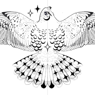


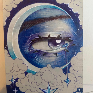
Although my mum liked this design of the kestrel with its wings open, my dad wasn't too fond of it. He liked elements of it, like the store and crescent moon patterns on the feathers, but he did not like the paws he suggested a more action oriented pause, as he felt. This one looked a little flat and lifeless. He liked the sketches I did of the eyes and asked me to keep them, but to just change the positioning and pose of the kestrel.


I looked at some images of kestrel's catching prayer and moving through the air. I referenced a lot of these images when drawing the specific kestrel. I then showed my dad. He liked this one a lot more. He told me that this one would be perfect if I added some the same stars and moons the last one had so I did.

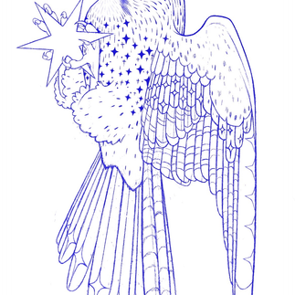

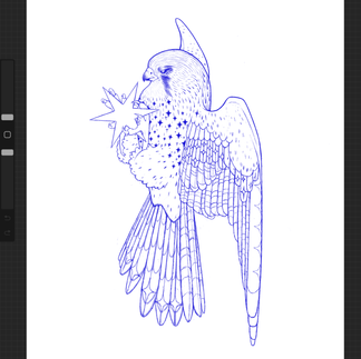
I was happy with this illustration, overall except something felt a little bit off about the face. I didn't really like the blank expression I was going for a more determined expression, and Mark said that the eye didn't look right and that gave me the drive to want to change it. I change the expression to be more angular and determined looking. I like this a lot more as it gives much more personality to the birds face. I did show my dad before and after and he liked it a lot more to as well as as my mum so I made the decision to scrap the old face and keep the new one.


After finishing the plan for the illustration, and then asked Andrew and Mark what the best way would be to transfer it onto the wood.I was initially just going to hand it and use my illustration as reference but after talking to Andrew he let me know it would take too much of my time I think he was rightdecided to try and use the projector as a stencil. After setting up, I realized I found it to hard to use the projector to draw it out. I was getting irritated by the shadows of my hand and head when I was trying to draw. I also did not like the angle I had to draw in, so I scrapped the idea.


The way I transferred the illustration onto the board was that I printed it off and rubbed graphite on the back of the paper, then press down with a pin on the graphite, and lifted it up, and the illustration transferred beneath. My auntie told me about this method that she uses when painting lodge compasses. I really like this method and how much time it saved me. my auntie has a side business where she pants portrait and let me know that you save time and money when using this method. I will be using this method in the future, as it really is a timesaver rather than redrawing the illustration again.
Holding and touching the board I can feel it has a texture that will make it relatively tricky to draw on to especially with adding interacts details. I did 2 coats of pain to see if it would help but it only lessened the bumpy texture of the wood slightly.


Originally, this was just going to be an illustration, as I am very unskilled at painting, and blending with paint, but it became clear to me that I would not be able to achieve a strong contrast on the wood with just a blue Biro. I found it hard to build up ink on the wood for some reason it didn't allow me to press down hard with the Biro. Something about the text wasn't allowing me to. I decided to get my old acrylic pants out and try to darken the areas of shadow to create a sharper contrast.

Although I feel I was successful in creating that harsher contrast I don't think I've blended the pants well, and the transition from dark blue to light blue did not blend very well. I don't wanna blame it on the pants but they are pretty old.


It's hard to see this image, but at the bottom of the board where I drew the line, I was testing, pens and paints to see how they would take to the wood, so it was covered in scribbles and paint swatches, although it would not be seen as the bed covers that part when hung up in the van I decided to paint over it and add pattern to it as it just gave them more finished and professional look.


the long thin lines that are seen in some of the artist inspiration works I shows to my mum and dad. They liked the idea to encorporate that into the final illustration to so I added some with white paint.


I was not at all happy with the shading of the eye the highlights looked boring and flat, and it was not enough contrast. It was also not clear that the blue light was coming from the star that I was looking at I decided to take a picture of it and draw over it on my iPad to see what I could do without directly drawing on it and making mistakes and having to cover it up. I wish I'd done this throughout the project as I wasted a lot of time painting over mistakes when I could've seen how they looked without making the the commitment of drawing directly onto the board.
Past work collage and highscool.
Unfortunately, over the years, a lot of matter additional work has been lost due to me, leaving sketchbooks at schools that I no longer go to or not properly documenting my work or losing pictures of my work. These are some of the pictures that I found from an old post I made. I thought I would add them here to show that I do have skills in multimedia.


One of my old projects from college was to design a made-up creature that could be short kissed as part of the logic comic that the whole class contributed to this was created using four point and pencil unfortunately I do not have the full picture of the finished comic, and only the small part that I made if I ever find the full comic, I will update this post.


Some of my old textile work, including illustrations and paintings and fabric as well as embroidery on fabric.


Some of my old illustrations that then for a college project, I was task with making the marketable by turning them into stickers or phone cases. Eventually, we did make them into stickers, but I don’t have any examples. Unfortunately, only the prototypes I made was that I drew with ballpoint pen on paper, then scan the images into Photoshop then added some effects then sent them to sticker website. unfortunately I don’t have any images of the finished stickers as I sold them or gave them to my friends.


Comments