
Character design projects
- Amber Boys
- May 20, 2024
- 35 min read

Updated: Jun 7, 2024
Some of my character designs
The goal of this project was to design a mascot for a T-shirt. The mascot had to have a message behind it or a social cause behind it. The social cause I chose to design the T-shirt around was animal testing
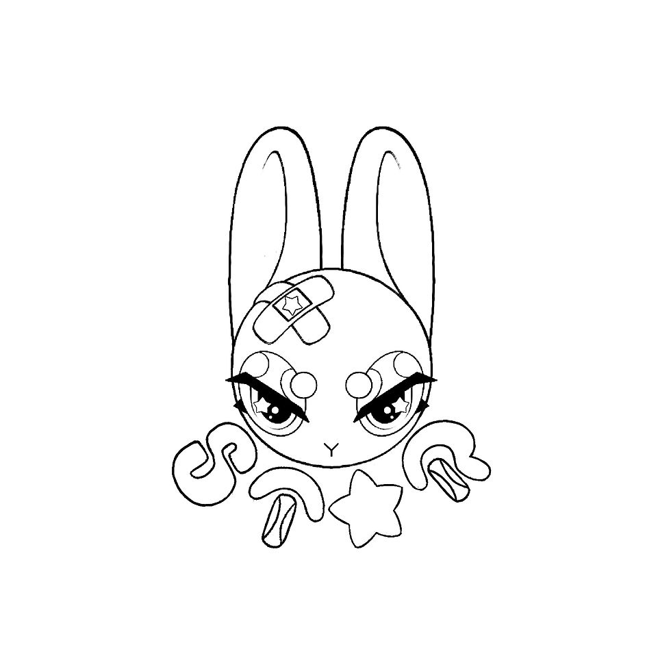
I needed to make a mascot that could be an advertisement for a charity of some sorts so I made up a charity called STAR and then designed a mascot around that charity then put it on a T-shirt. You can see my design process when creating the mascot.. the STAR charity stands for start treating animals, right. You can see below how I create different body types, different hairstyles and eye styles as well as different color pallets and motif placements in order to create a successful character designI wanted to branch out and create all the animals such as rats and dogs that are often tested on if I was further, I would definitely make a whole line of mascots and maybe try and advertise a charity through them. I wanted to them to look, lovable and marketable and appeal to a large target audience.
As an animation student I have decided to design a character from my shirt as I specialize in character design, so rather than having different concepts for shirts, I will be showcasing different concepts for a character that will eventually go on the shirt.
When thinking of factors, and creating a cute character proportions come to mind being a character design student, I have learned that the proportion of the head indicates the age of the character so the larger the characters, head, and eyes relative to the size of the body is an easy way of having a character be perceived as cute. another way of adding cuteness to your character is round soft edges, typically this will also be read as cute this is because these features are similar to those of a baby or a young animal, and humans naturally respond to these features with feelings of warmth and protection.
Looking at other card, designs of cute characters you'll see that the head is often larger in proportion to the body than it is in real life. This creates a childlike appearance, which is often associated with innocence and vulnerability. Additionally, having a small nose and mouth, as well as rounded cheeks, can also contribute to a character's cuteness.
The size of a character's eyes is also important when it comes to creating a cute and endearing character. Large eyes are often used when designing characters that you want your audience to like as eyes and eyebrows are how we read expressions in people it's the same for cartoon characters, characters with larger eyes and eyebrows, make it easier for the view to see how they're feeling. Thinking of all these aspects I will try and create a character that includes large eyes, round soft edges, and a large head in comparison to the body this way it will make it easier to craft a lovable character that your viewer will empathize and care about more.

Here I experimented with body proportions, such as length in the arms and stretching the torso, also enlarging the eyes or shrinking the head down I wanted to see which silhouette people would find cutest and more drawn to.
After asking if you have my friends on class members the lodge, I have an eyes along with the chubby her body was seen as the most endearing this makes sense.
looking at widely loved, and recognizable characters like Mickey Mouse, Kirby and Helo kitty I can see that they have all been designed with roundness in mind. There is a psychological reason behind this phenomenon, and it all comes down to how our brains perceive shapes.
The "roundness preference effect" is a psychological phenomenon that suggests people tend to perceive round or curved shapes as more pleasant, friendly, and approachable than those that are angular or sharp. This effect is thought to be linked to our natural instincts and experiences - in nature, round shapes are often associated with safety, comfort, and nurturing, while angular shapes are associated with danger and threat.
When it comes to character design, animators and artists have long understood the power of roundness in creating likable and relatable characters. By using curves and circles, they can create characters that are approachable, friendly, and more likely to elicit positive emotions from the audience. my character needs to create these feelings in the audience, in order for them to empathize, and want to protect the character from harm such as animal abuse. Of course, this is metaphorical. I want my character to be used as a tool to bring awareness to the horrors of animal abuse so it is vital for the character to be cute and endearing.
looking at some examples of popular characters that use roundness in their design:
Hello Kitty: character from Sanrio is designed with a simple circular head, rounded ears, and a cute button nose. Her roundness makes her look innocent and approachable..
Mickey Mouse: Disney character is designed with a round head, round ears, and a circular body.
Kirby: The pink, marshmallow-like character from the Kirby video game series is designed with a spherical body and a cute, round face. His roundness makes him look soft and huggable.
I want to take inspiration from these characters and have my character be very round and soft looking to invoke a similar effect.

I made a small pole on what people preferred as a base for the mascot character for animal welfare awareness. A lot of people really liked the paws I also thought the polls are really cute but I made the decision not to keep them as I want to design to be very simple and found that rounding off the hands and feet audits the design simplicity. I also like the idea of giving the cards are in mouth and nose. But I wanted the expression to be seen Soulive through the eyes, so also ended up scrapping the idea.

The visual portrayal of eyes can convey valuable information about a character's personality, temperament, and appeal. My aim was to investigate the various eye shapes and their association with different character attributes.
Rounded Eyes
Rounded eyes are often connected with a character's friendly, innocent, and congenial disposition. These characters are usually likable and super relatable to the audience. Furthermore, round eyes may imply a childlike nature, making such characters charming and adorable.
Sloping Eyes
Sloping eyes can be utilized to generate an intimidating or enigmatic character. They can evoke suspicion, danger, or cunningness. Characters with sloping eyes are frequently multifaceted, with covert agendas or conflicting emotions.
Angular Eyes
Angular eyes are often linked to logical, precise, and analytical characters. These characters are methodical and calculated in their actions, making them appear cold or detached at times. Additionally, characters with angular eyes may be perceived as more serious or mature.
Egg-Shaped Eyes
Egg-shaped eyes are more flexible and versatile than other eye shapes. They can be employed to create a variety of character designs, from playful and whimsical to serious and sophisticated. Oval eyes tend to be less distinctive, creating a sense of ambiguity or enigma surrounding a character's personality.
Eyebrows
The shape of eyebrows is also a crucial factor in character design. For example, arched eyebrows can create a more dramatic or expressive character, while straight eyebrows can indicate a more restrained or stoic personality. Thick eyebrows may imply strength and determination, while thin eyebrows may indicate vulnerability or sensitivity.
Expressions
The expression of the eyes is another crucial factor in character design. Characters with wide, open eyes can appear more vulnerable or innocent, while characters with narrow or squinted eyes may seem more focused or suspicious. Additionally, the size of the pupils can also indicate different emotions or moods. Dilated pupils may indicate excitement or fear, while constricted pupils may suggest anger or concentration.

Tge shapes and silhouettes of characters play an essential role in conveying their personalities and emotions. In this blog post, we will explore different shapes in character design and what they can signify to an audience.
Shape Language
Shape language is a concept that is commonly used in character design to convey meaning to the audience. By using different shapes, designers can create an immediate emotional response and help the audience understand the character's personality and motivations.
Rounded Shapes
Rounded shapes are often associated with characters that are friendly, warm, and approachable. Characters with rounded shapes tend to be perceived as cute, innocent, and charming. These shapes are also often used to depict characters with childlike qualities, making them relatable to a younger audience.
Sharp Shapes
Sharp shapes, on the other hand, are often associated with characters that are aggressive, dangerous, or powerful. Characters with sharp shapes tend to be more intimidating and may have a more serious or edgy personality. These shapes can also create a sense of tension or danger, making the audience feel on edge around the character.
Horse-Shoe Shapes
Horse-shoe shapes, which are shapes with rounded sides and sharp corners, are a relatively recent trend in character design. These shapes can be used to create characters that are both approachable and edgy, combining the best of both worlds. Characters with horse-shoe shapes tend to be relatable and likable but can also have a hidden depth or complexity to their personality.
Current Design Trends
In recent years, there has been a shift towards more simplistic character designs, with a focus on creating iconic and easily recognizable silhouettes. This trend has been influenced by the rise of mobile gaming and social media, where characters need to be easily identifiable at a glance.
In addition to simplicity, there has also been an emphasis on diversity and inclusivity in character design. This includes characters of different races, genders, body types, and abilities. By creating characters that represent a wide range of experiences and perspectives, designers can make their stories more relatable and inclusive.

Although I liked the circle head shape I wanted to try some different options to see if I could create a more unique looking character. And character design different hatchets can indicate a different characteristics of the character.
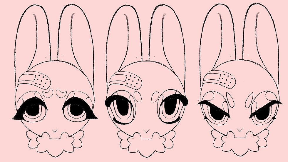
Asking members of my class, family and friends. These were the three most common eye ships the people were drawn to. The base of each of them is an oval.
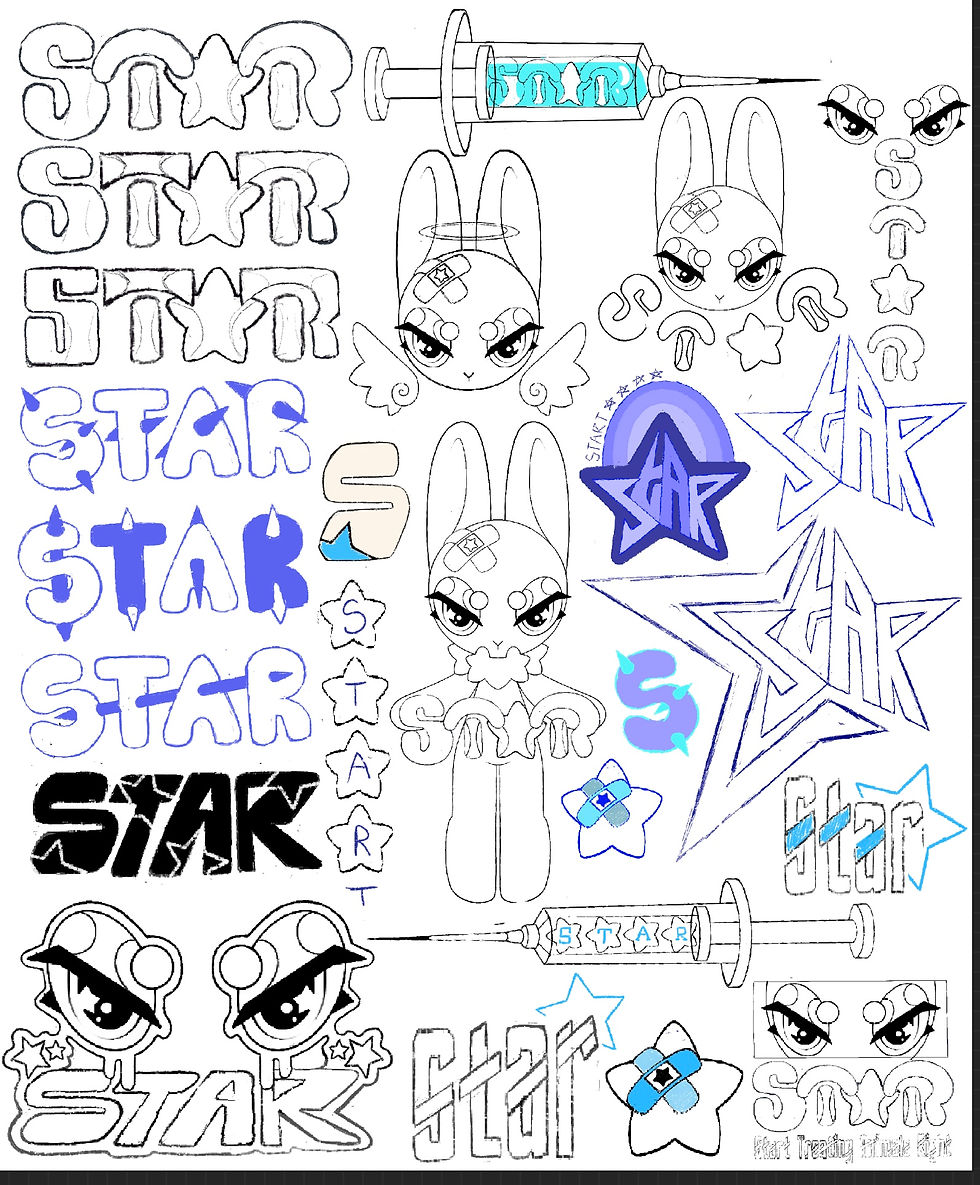
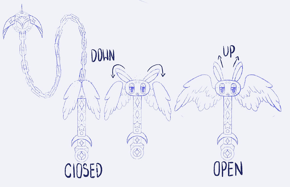
I came up with an acronym STAR that stands for start treating animals right.I did this because a lot of charities use acronyms as names think of WWF RCPCA and PETA. I wanted to incorporate a star motif into the design of my bunny rabbit mascot to link it with the acronym star. These are a few concepts of where the star could be placed on the character. I chose to use a puffy star made up of round curved edges rather than a sharp star as it fits with the round design much better.
A motif is a recurring theme, symbol, or element in a story that can be used to convey meaning and create a sense of cohesion. In character design, a motif can help a character become iconic and stand out from the crowd.
Motif in Character Design
A motif can be any recurring element in a character's design, such as a particular shape, color, or accessory. By using a consistent motif throughout a character's design, designers can create a sense of unity and cohesiveness, making the character more memorable and easily recognizable.
For example, the character Pikachu from the Pokémon franchise is instantly recognizable due to his consistent use of a lightning bolt motif. The lightning bolt is present in Pikachu's ears, tail, and cheeks, creating a clear and cohesive design that is easily identifiable.
Motif and Character Appeal
A well-executed motif can also enhance a character's appeal and add depth to their personality. A motif can be used to represent a character's backstory, personality traits, or motivations, giving the audience a deeper understanding of who the character is.
For example, a character with a star motif might be seen as optimistic, hopeful, and dreamy. The shape of the star can also convey different meanings. A rounded star, for instance, might be seen as playful and whimsical, while a puffy star might be seen as soft and comforting.
Motif and Storytelling
In addition to adding depth to a character's design, a motif can also be used to advance the story and create a sense of continuity. By incorporating the motif into the story itself, designers can create a sense of cohesion between the character and the world they inhabit.
For example, a character with a star motif might encounter challenges and obstacles that are also star-shaped. This creates a sense of continuity and reinforces the importance of the motif within the story.

I picked three placements of the star motif that I like the best I picked three as I didn't want to star to become overpowering to the character design. I picked the Band-Aid/plaster as that is a significant part of the design as it is representing the animal, being injured, and what I want the mascot/logo/character design to represent eye pics the eyes as I want a lot of focus on the expressionon a Peter tail because it's just cute and charming and I think it would have a wide appeal.
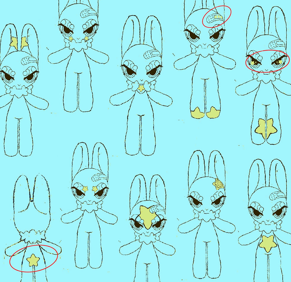
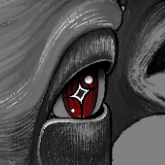
Choosing the color palette for my character design I knew I wanted one of the eyes sclera is to be pink or red as it references, the dry eye test that is often used on rabbits in animal testing along with the plaster representing the dry skin test. I think one of the eyes having a red sclera is a good representation of the dry eye test.


Befor picking some colour pallet options I wanted to go back and experiment with the knowledge I already had ralating to colour theory.
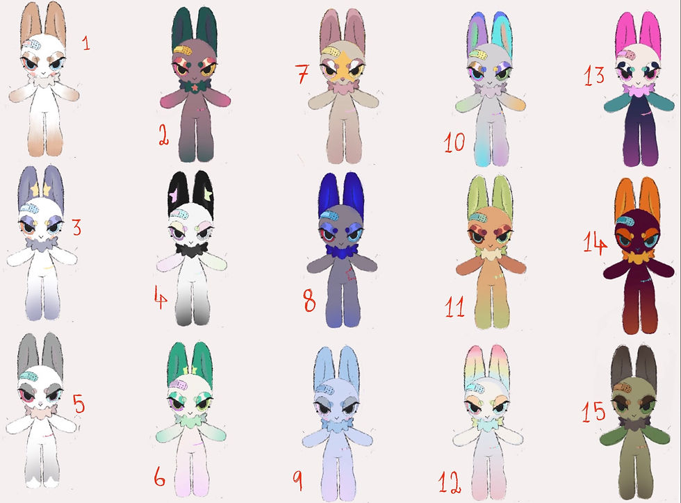
Number three was my second choice. It's a number one as it also has a naturalistic color palette in away, gray and white with accents of blue and red. I really love the star on the ears, the pop of yellow really stands outThrough that I didn't use this one is because I simply like the design and color pallets of number one better. Although I do like number 11's color, palette and design, I feel that it is too unrealistic with the color choices. I do really like the design of number seventhe bright star incute design idea and integrates the star motif in a cute creative with, although I think it closes up the first quite a bit. Overall the color palette and star placement a number one or simpler and easily understood unreadable design compared to the others.

As an experiment, I wanted to take the color palettes from popular main characters of TV showsI specifically chose to use the main characters because I wanted to see if there were any trans between any of them. Looking at these now I can see that all of them have at least some yellow in their design be that small or large amount yellow is symbolically a happy and bright color. Most main characters contain some amount of yellow for this reason. I'll be trying not to use yellow in my final design as I still want my design to have a somber feel to it as it is representing some thing depressing and saddening like animal abuse although my bunny character design is cute I still wanted to be best and somesort of realismso using more realistic colors, and avoiding yellow, will help me with grounding the design.

This is the final color palette I went with. I picked this one because it is natural relative to the other ones brown and white with accents of pink and blue.

Although I was happy with this design, I wanted to see if I could change some thing about it. I was unhappy with the plaster/band-Aid, as it was very flat and boring also looked to similar to a real world plaster. I wanted to make it more visually interesting, so I added to plasters in a crossed over pattern instead, I think this is cute and more cartoony and fits the cartoony aesthetics of the character it's better.

The plaster, the eye and the stitch on the right side of the bunny's hip all represent injuries that rabbits go through when animal testing, one of the eyes is red, representing the dry eye test. The two other injuries on the skin represent the dry skin test. these are cruel procedures that are carried out during animal testing.

This is my final design. If I was to change some thing about it I might remove the red cheeks as it slightly clutters up the face even though I do think they are cute and appealing. I think I would also remove them too, because they are very reminiscent of Pikachu, which is an already iconic design.
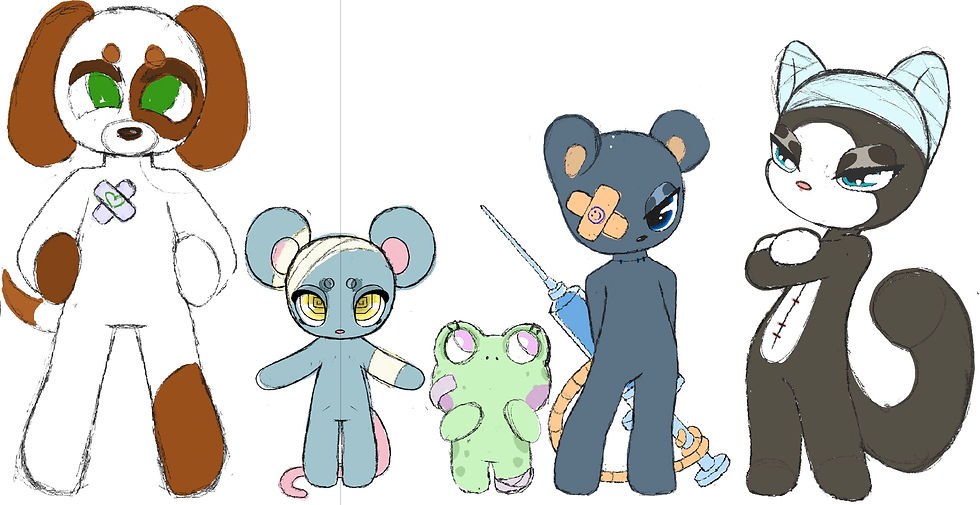
I also tried out some different animals that are commonly tested on beagles mice, frogs rats and cats are also tested on just as frequently as rabbits are. Using the same body base, round head and a rounded hands and legs, I created a few designs that could be alongside the main rabbit design. For example, hello kitty is often depicted with her friends that are depicted as different animals. I thought it would be cute to give the bunny some friends. And this could also show the other types of animals that are subjected to animal testing.
Font Style & Character Placement.
these are some logo concepts. I had the idea to have a logo on the front and then the lodge design in the back as a lot of shirts do that it's a popular style for graphic T-shirts.
During the 2000s it was a time of change and innovation in the world of design. This was reflected in the logo and functions of the era. I want to explore some of the key features of the 2000s logo and font type first designs.
A trend that I noticed is the use of bold lettering many logos from this era featured a thick sans serif, type face with clean lines, giving them a bold, confident look.
Simple geometric shapes are another thing that stands out to me as being iconic of the 2000s type face many logos featured square or rectangular shapes often with round corners and a minimalist design that emphasized simplicity and clarity
Many designers of the 2000s used large, blocky typefaces with clean lines and sharp edges to create a bold, eye-catching look.
Another common feature of 2000s font design was the use of stylized letters and symbols. Many fonts from this era featured unique, stylized versions of letters, numbers, and punctuation marks that helped them stand out and grab attention.
Many designers in the 2000s embraced the use of bright, bold colors in their font designs. These colors often contrasted sharply with the background, making the text more visible.
There were many iconic logos and fonts that defined the 2000s era. Some of the most memorable logos from this time include:
The Google logo, with its sans-serif typeface.
The Nike logo, which shows a bold, all-caps font and a distinctive "swoosh" shape.
The MTV logo, has a blocky, all-caps font with a distinctive "M" shape.
Impact, a bold, all-caps font with thick, heavy lettering that became popular for headlines and display text.
Character placement

One of the most common ways that posing is used in character design is to convey the character's level of confidence or shyness. For example, a character who is shy or introverted might be posed with their arms crossed, their head down, and their body hunched over. This type of pose suggests a closed-off, defensive posture, indicating that the character may be feeling insecure or uncomfortable in their surroundings.
On the other hand, a character who is confident and outgoing might be posed with their shoulders back, their head held high, and their arms extended in a wide, welcoming gesture. This type of pose suggests an open, expansive posture, indicating that the character is comfortable and confident in their surroundings.
Other Poses and Emotions
Of course, posing can be used to convey a wide range of emotions and traits beyond just shyness or confidence. For example, a character who is angry might be posed with their fists clenched and their muscles tense, while a character who is sad might be posed with their head down and their body slumped.
Similarly, poses can also be used to convey a character's profession or occupation. For example, a character who is a detective might be posed with their arms crossed and their head tilted, suggesting a thoughtful, analytical approach to problem-solving.


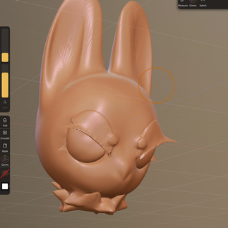
I recently downloaded nomad sculpt, which is a 3-D sculpting app. I wanted to try out, sculpting a 3-D model of my character design to help me better understand its head in 3-D space and better help me pause the head on the T-shirt. (This was the first model I made on no mad so isn’t the best but I think it shows my improvement)
Final design ready for screen printing

I'm happy with the way this design turned out. I think I have captured the 2000 style along with the type face at the bottom. The story motif is heavily integrated throughout the design on the tight face.I'm happy with the clean lines, although I wish they were a little bolder.
screen printing PDF


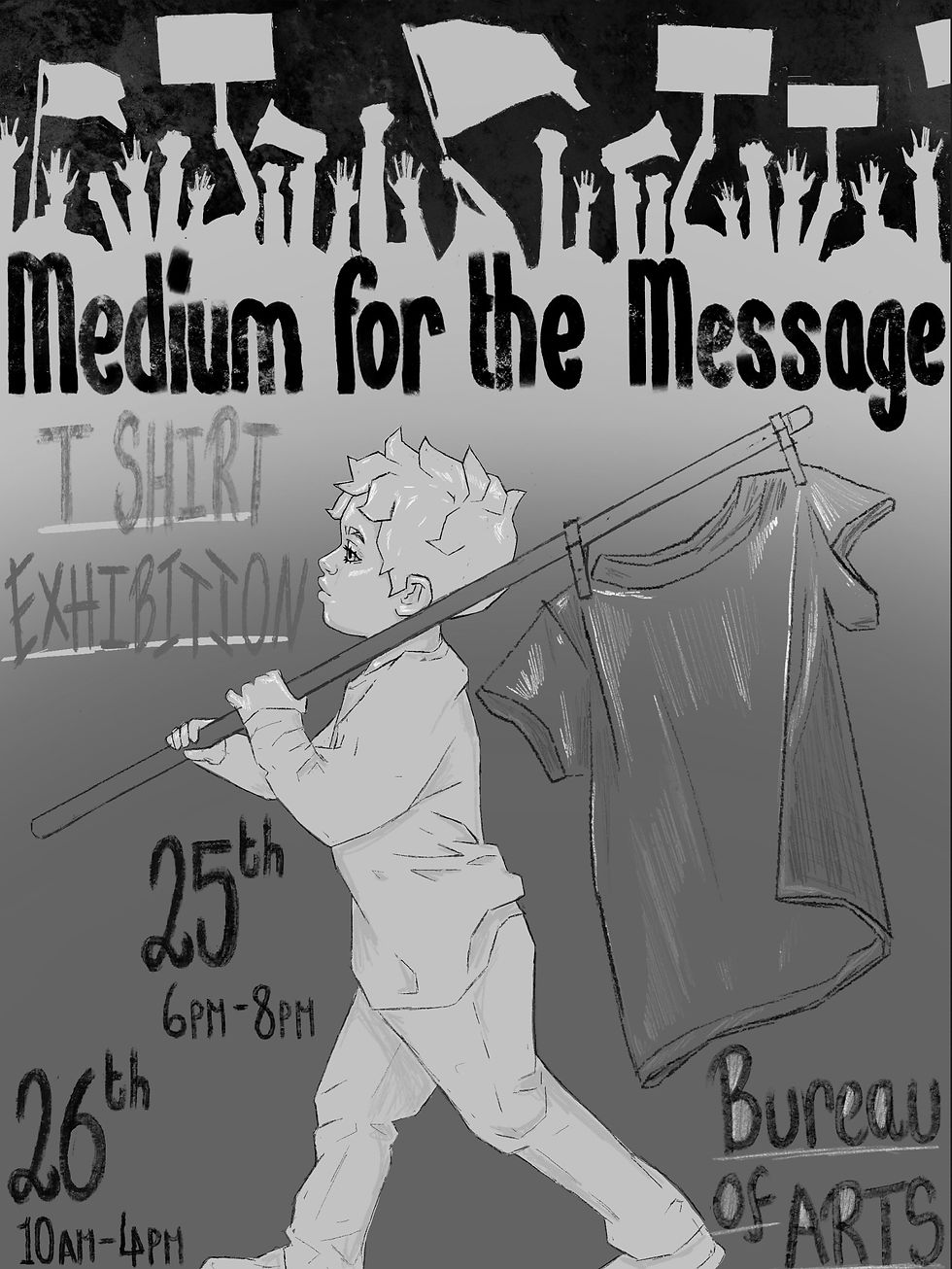
I like the illustration I did for this poster and I like the idea behind it. I think it conveys the message of using T-shirts as a way to market a message on the movement. The logic behind it is that flags are often used in protests and have messages on them. They are used to get across a message. similar to how we would be using T-shirts in this project. The things I am unhappy about with his poster are the writing is not as clear as I want it to be I use the pen with a texture that imitates charcoal as I wanted it to have a more naturalistic feel I wish I could use the pen that imitated something like viral so the word stood out more.
CDC competition https://characterdesignreferences.com/news/theme-of-the-month
I decided to do another competition for part 2 of external entertainment as I didn't want to overwhelm myself with the expectation of another client. I chose to do the cdc compaction as I am already passionate about character design and I really enjoyed the theme of this specific character design competition.
This competition wants you crate a krampus character design. If can be any medium and can be created for any genra as long as the design looks like krampus.
professional
Personal goals
• create a unique tech on Krampus.
•make it design that I personally like
•Make sure it linesand have a good way to them so I can show this in a professional portfolio.
Professional goals.
•meet the competitions criteria.
•achieve the 7 merits the project is worth.
I wanted to create a krampus design that had some sort of lore to it. I wanted it to have a fable type dark fantasy vibe to it as i would be taking inspiration from characters in games such as Elden ring, dislight, blood borne and movies like hell boy and pans laberenth. I realize that this is the type of thing I usually draw that being creepy fantasy, so it doesn't present a challenge for me in that aspect. Although I will be challenging myself by aiming to create a full character sheet with a back story and multiple drawings of the same character (something I find challenging)
Another challenge will be fitting the criteria. Not a huge task as the criteria is braud. But I do have to keep it in mind and complete my work in time as well as design a character that fully meets the competitions criteria.
What are the basic trade marks off krampus?
after looking at many different designs of Krampus, I noticed most of them are contained at least one of these elements.
Sharp horns
Many long sharp teeth
Long tongue
Chains
Basket or sack (for carrying away misbehaving children)
Furry or demonic appearance
Cloven hooves
Hunched or menacing posture
Fur-covered body
Bells or bells attached to chains
Tongue may be depicted as forked or unusually long
Sometimes portrayed with a bundle of birch branches (used for swatting naughty children)
Sharp claws
Red or glowing eyes
Horns adorned with ornaments or symbols
Tattered clothing or fur
Krampus may be depicted carrying a bundle of switches or birch twigs
Facial details
I wanted to pick one element that is iconic to krampus and push that one element through the design. Because focusing on a single defining element, such as chains, and incorporating it consistently throughout the design can make my Krampus character more memorable and visually cohesive. This approach not only makes a strong visual identity but also creates a thematic thread that ties the different elements together. It helps in conveying a specific narrative or symbolism, making my Krampus design stand out and be more recognizable. It will also provides a unique twist to the traditional Krampus imagery, allowing for a fresh and distinctive interpretation of the mythical creature. I don't know what my chosen elementwill be yet but the chosen element can enhance the overall impact and make your Krampus design more iconic and visually striking. I'm thinking maybe chains or teeth will be my distinctive design element.
Teeth:
Symbolism: Sharp teeth can symbolize threat and danger, emphasizing Krampus's role as a fearsome figure.
Menace: Incorporating prominent teeth can enhance the menacing and predatory aspect of Krampus, reinforcing the folklore surrounding the creature.
Visual Impact: Well-designed teeth can draw attention, adding a visually striking and memorable element to your character.
Chains:
Symbol of Control: Chains can symbolize control and captivity, reinforcing Krampus's role in disciplining or punishing misbehaving individuals.
Consistency: Using chains consistently across various elements, like horns or clothing, creates a cohesive design and reinforces the narrative of restraint or authority.
Unique Interpretation: Focusing on chains allows for a unique interpretation of Krampus, providing a fresh take on the traditional imagery.
Ultimately, the choice between teeth and chains depends on the narrative or message you want your Krampus character to convey. Whether it's the threat posed by sharp teeth or the symbolism of control through chains, both can contribute to a visually impactful and thematically rich design


Consept sketches for the original concept I wanted to push the aspect of chains and teeth. I was thinking he could have chains hanging from his horn or her had another idea of having a chain halo. I dropped the chain part of the idea, though, as I think, focusing on one aspect of the symbolism of Krampus would make this project a lot and the final design more coherent.


I felt like the designer was going for liked Christmasy elements. I wanted to try and reincorporate some Christmasy visuals. I had the idea to give Krampus, a red furry neck and the White highlightsof the fur would be reminiscent of the stripes on candy canes. Although I don't like the sketch I did I do like the idea I just don't think I translated it into a visual form well enouge. I scrapped the idea and decided to add Christmas elements in another way. That being the pattern on the robes and the star of Bethlehem symbolism throughout the design.
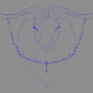
Originally, my Krampus design leaned towards a more goat-like appearance, adhering to the traditional placement of goat eyes on the sides of the head. However, I made a deliberate decision to enlarge the eyes and shift them slightly closer to the center of the face. Unlike goats, humans and other predatory animals like dogs and cats have forward-facing eyes, a feature that tends to be more relatable for viewers.
The adjustment not only enhances the Krampus's ability to establish eye contact, creating a more direct and potentially threatening gaze but also aligns the design with characteristics that are easier for people to connect with emotionally. Forward-facing eyes are often associated with a sense of intention and focus, making the Krampus character more engaging and relatable to the audience. This modification serves not only as a stylistic choice but also as a strategic one, allowing for a balance between the creature's mythical and relatable aspects within the design.The face is still very goatlike, but has more human eye placement.

You can see in the eyes I added a four pointed star rather than the rectangle, pupil goats usually have.


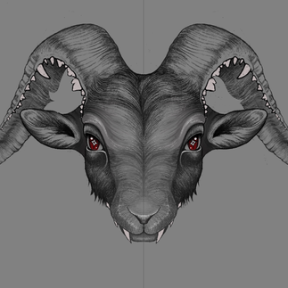
In crafting this character design, I placed emphasis on diverse patterns and textures to enhance its visual interest. I added added a muddy texture at the bottom of the robe, a deliberate choice aimed at conveying a sense of lived-in realism.
I also added a multitude of patterns. However, a made sure to avoiding an overwhelming clash of patterns by mixing and matching them to see what ones clashed and what ones worked well together. On the final design I kept the patterning on the cloaks outside and inside and then only had minimal patterning on the under cloak. The intention was to maintain a harmonious aesthetic, making sure the that the various patterns complement each other rather than compete for attention. I did this because I want to create a cohesive and visually engaging character.
I made some basic patterns myself by getting inspiration from looking at Germanic textile patterns, and coming up with my own. I often saw that the patterns included reindeer and cows. The animal I added, was a goat for obvious reasons.


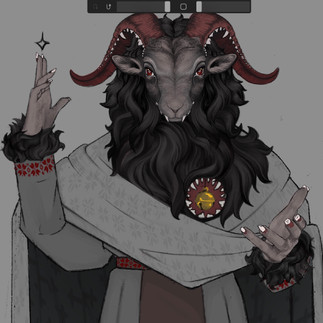
I went through a few different color pallet ideas. The biggest change for me was the bell in the heart going from silver to gold. I did not want to overcomplicate the color palette as I wanted this character design to be reminiscing of that from blood-borne that being dark, gloomy, simplistic color, pets that create a dingy Gothic atmosphere, but I think the gold bell doesn't overpower the pallet too much and it well. I did some pets with a lot more red in them. Although I didn't hear both of these options, the red and green, one and the red and gray one.

Final design
We were tasked to create a creature that was made up from two different animal parts. We picked two cards at random and whatever animals were on them, we then had to turn them into a creature design.

The cards I picked were a squid/octopus and a lion.
I only did one design for this rather that drawing a few possible concepts as it wasn't linked to any of my narratives. I also just generally liked the idea of a lion with tentacles for a mian.

I had a great time with this task and didn't put any pressure on myself to make it relevant to the project as a whole. I still applied techniques learned in the project, like color theory. This experience taught me to not put too much pressure on myself in future projects
Re designing classic Greek mythology gods and monsters
My game will be an action adventure game with some platform elements. I would like to put the games have an off in the world feel but overall goal given to you by Hermes. The end goal of this game is to complete all the text Sammys gives you and become the next messenger of the gods, the game will have a light hearted feel. I want it to be quite thrilling with intense/scary moments. But have an overall whimsical field to it.
Game overview and story. The overall story of the game will be that the god Hermes from Greek mythology is going on holiday and looking for an heir to take on his role as a messenger for the Gods. You would player as a character, taken from the human world, and chosen by Hermes for a specific reason. Each character would represent a quality that Hermes possesses or is known for. You would be able to play as any of the characters you choose. There's 11 characters in total to choose from depending on your personal play style there will be a small arena where you can play as each of the characters and see which one you like best. They all have different weapons in abilities so this will give you a chance to take a feel for each character, and choose which one the best suits you and and what type of gameplay you want for example, some of the characters have wheels, and can move very fast and dodge objects. Other characters have large weapons and are slower, but deal greater damage, when attacking an enemy some of the courage to South, more jealousy than a lose some of them have better shielding capabilities and others are more exposed, but have long range weapons rather than melee weapons so it would really depend on the player prefers to play. Once you've chosen your character, you would meet Hermes. He will tell you the rules of the game and give you goals and tasks to accomplish.
Replayability
I would like to think this game would be enjoyable to play more than ones as there is a lot of characters to choose from that is one reason why I play on my I haven't sent it to play again they want to see how the game will be played by choosing a different character also different characters will be able to unlock different levels due to the special abilities.
If I was making the skin in real life, I would intend Nick the world and levels, interesting and challenging. This would also give the player the reserves to play more than once.
This game will be an app as it makes it more accessible to a larger audience.
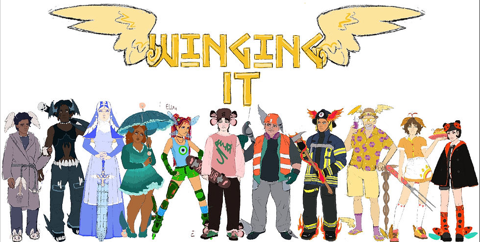
Character side by side
I wanted to have a wide selection of characters and have them each be very different from one another. I think representation even in phantasy settings matters so I tried to give my characters different body types ages and skin tones. The characters all have different play styles to. Some have melee weapons while others have long range weapons so each different character will be appealing to a wide range of players.I wanted to add even more and had plans for character customization and different skins when leveling up your character to add to the personalized feel but unfortunately ran out of time.
at the start of the game you will select your character. You have a chance to practice with each character in a fight against Hermes. This way you can practice with each characters weapon and see which one suits you best and matches your play style. You can then train with Hermes once you have selected your character. Once you have selected your character it cannot be changed until you complete the game or reset.
Why is doing a character line up important when designing multiple characters for one project?
Proportions
Clashing colors palettes
hight
Differentiation
Creating a character line-up is important when designing multiple characters for a project.
It allows you to see all of the characters together in one place.
You can compare and contrast them in terms of their design, proportions, and overall style.
A character line-up can ensure that each character is visually distinct from one another and that they fit within the same visual language and style.
It is especially important if the characters are going to be interacting with one another in the same scene or story.
A character line-up can help you identify any inconsistencies or design issues that may not be immediately apparent when looking at individual characters in isolation.
It can help you adjust the design of each character to make them more cohesive and complementary to one another.
A character line-up can be useful for presenting the characters to clients or stakeholders, as it gives them a clear visual overview of the characters and can help them make informed decisions about the project

Looking at these two characters together in the lineup, I realized that their color pallets were very similar. They both had a green and blue color palettes. To better differentiate the characters from each other and give them more unique designs. I decided to change the color palette of the dragonfly girl I felt that the seafoam green matched the umbrella girl better as her theme was overall related to the ocean so I kept her with the seafoam green and change the dragonfly girl to a more grass green. I would not have realize this and less I did the character lineup so this is another reason that is useful tool for character designers. Sing these two characters together. I also realize that their heads and bodies were out of caution to each other. They didn't look like they were in the same universe. One of my pet peeves is when cartoons and animation give baby characters, and Young hearts is larger on the parents rather than shrinking the body. I also change the head and body portions of these cards, so they look like they are in the same universe, and also look like they are better proportion I enlarge the dragon girls head and shrunk slightly at the umbrella girls head as you can see my final designs of these characters.
I wanted Hermes to have a rich, retired old man look somebody that you would see in the casino or the side of the pool. I gave him an Hawaiian shirt with a crocus flower on as a crocus flower represents Hermes in Greek mythology.
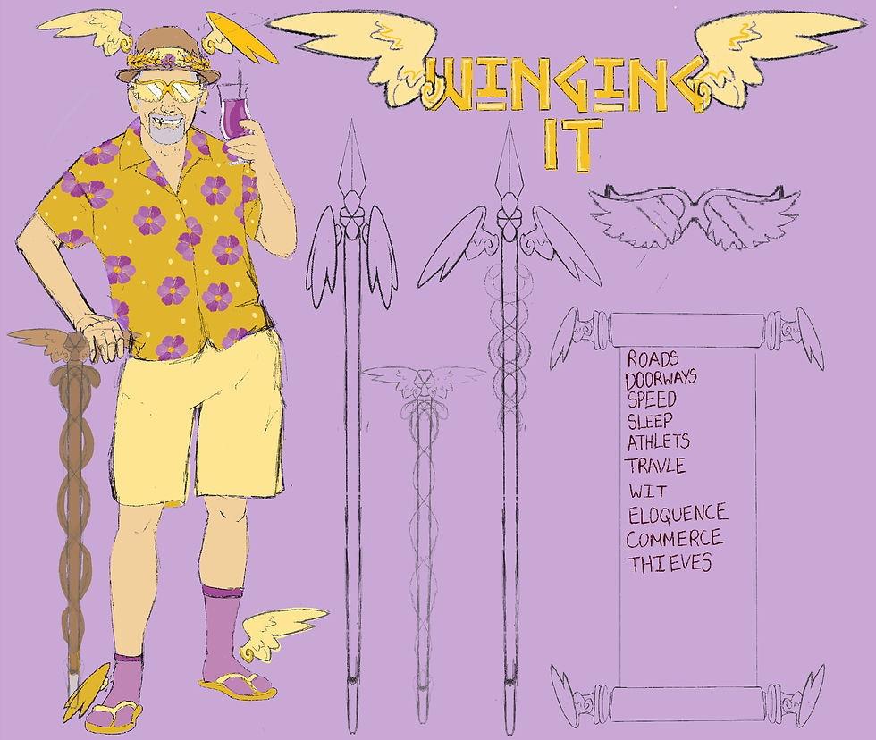
This is my final character design for Hermes. His props would include a winged spear that can transform into a Walkingstick sunglasses in the shape of wings, and a scroll with each of the characters classifications.His color palette is yellow and gold and purple. All these colors indicate royalty purple as in the past it was mainly worn by Royals and gold, as it is seen as a wealth signifying color. Even the gods are immortalI do not edge I like to think of Hermes in this old man formis just one of his many transformations. Gods were known for transforming, and I think this would be a cool aspect of the game. Unfortunately, I run out of time and only managed one concept design for him.

This character would represent thieves. The reason for this being that her backstory is that she would steal from rich people and give to the church to help people in need and get people off the streets nan stuff ya know. She's a thief, but I didn't want my representation of thieves to be a cat burglar because I think they will be two generic and not somebody you'd want to play as. I combine both concepts sketches to crater the final this design. Although I really did like the idea of having Stainglass wings on her head, I felt like it cluttered up the design and made it too top-heavy so instead I give her the wings that rap around her head scarf.

this character would represent athletes as he is a baseball player threes, and I gave him a goth aestheticas I feel like that matches the bat wings betterI gave him batwing simply because he's holding a bath and I thought it would be cute.His backstory could be that he is a baseball player that is also super emo. Reason for giving him fines on his belt pockets and shoes are because they just look cool. Also, the bat wings represent a vampire bat so it doesn't make sense.
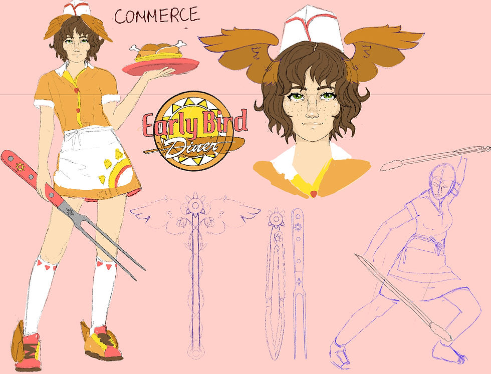
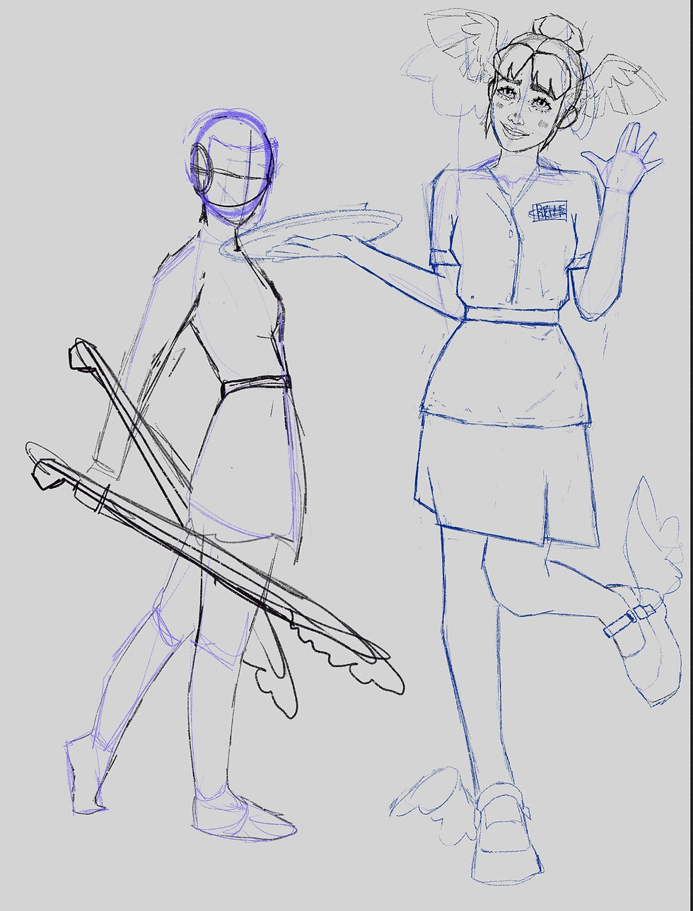
This character would represent commerce. Commerce is represented by this character as she is involved with buying and selling on a large scale, specifically selling a supermarket chains are known for their selling of large amounts of food to a large amount of people. Commerce can also mean the social dealings between people, which I think a restaurant/diner represents perfectly. The wings I had a chicken wings as the early bird diner. She works for specifically serves chicken. I gave her another weapon as well as the barbecue tongs. The weapon is a picking carving fork.


This character would represent speed I had a few ideas for speed the one I ended up going with is a roller derby girl. The wings are used to represent the speed of dragonfly wings. I gave her the evil eye as a paturn on her shirt as the evil eye is a Greek symbol. I wanted to incorporate the symbol into at least one of my characters. I added it the the wheels of her rollerskates, her jewelry and her top. I gave this character a paresthetic leg as I think it would be a good representation for amputees. Also, it's just a cool design.

This is the character that would represent doorways, I thought a fire fighter would be a good way to represent doorways as firefighters have specific access to smash through doorways and save if people from fires. I haven't drawn out for the flames on her shoes on the flames on her ask would be able to turn into Phoenix wings as well as the flames on her hat.
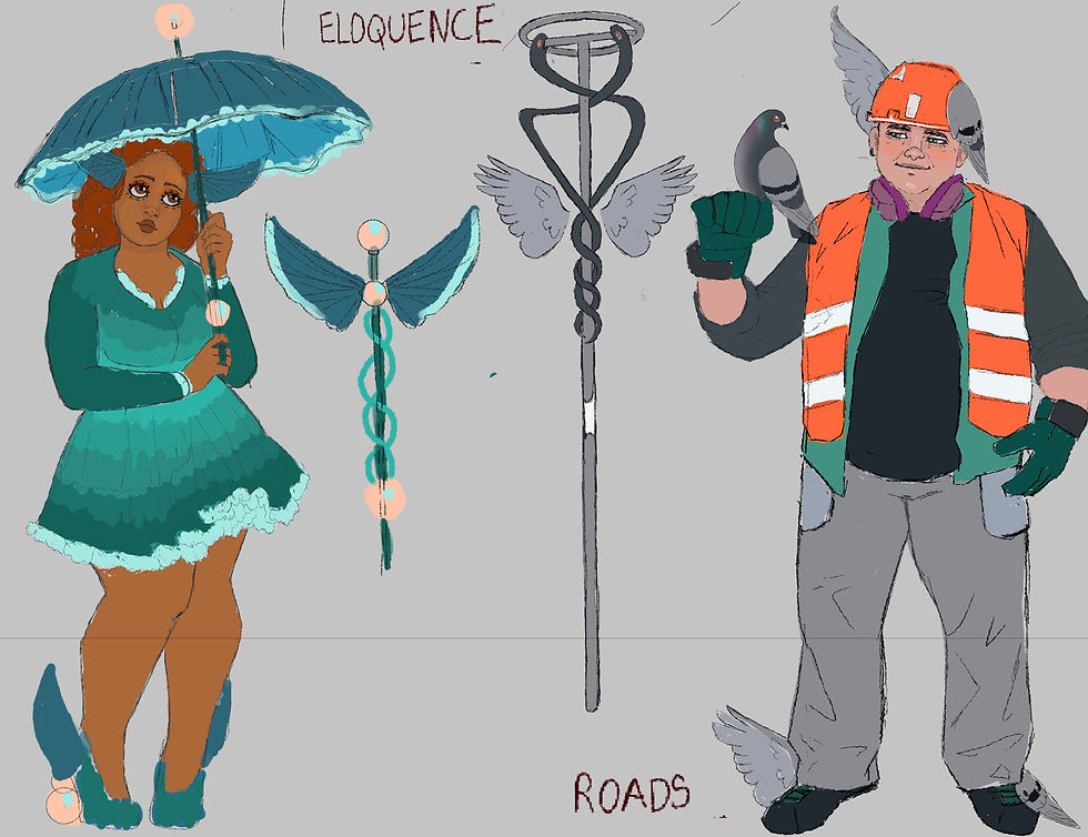
These two are the current designs for roads and eloquence. The representation for roads is a cement mixer. I thought this would be a good idea as he is envolved in making roads and pathways. It was hard to think of somebody to represent eloquence as it is a less tangible concept than something like doorways or roads. I decided to make a Lolita style girl as that is the first thing that came to mind I wanted her to look like she would speak very eloquently. Her wings are the wings of a flying fish. I don't know if I explained well enough but in this game each playable character will have 2 sets of wings. One on their head and one on there shoes showing how they are linked to Hermes.

These two characters would represent travel and sleep. The character representing sleep is dressed in a dress and gone with bunny slippers. I went with the more obvious approach to this that he's just to do that like sleep or he works nights shopping center or something like that maybe? I gave him the wings of a snow owl. I did this because I was known for being nocturnal. The stuff he has would match his bunny, rabbit slippers do you know run out of time to design his shoes unfortunately. His weapon is a chain whip that would he would wrap around his waist. I think I like this design as it emulates the belt of a dressing gown.

Game interface
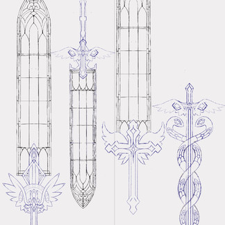
This is what I think my game interface would look like for when you are choosing a weapon. It also shows how to upgrade weapons. The little dagger in the left upper corner represents how far away you are from upgrading to the next weapon once it feels to the top that is when you will unlock your next weapon. All characters will start off with the snake staff then evolve into the weapon after they get skills and progress through the game. At the top of each weapon are Greek numbers and the symbols at the bottom our stars that represent how powerful weapon the weapon is, and how powerful it will be in combat.
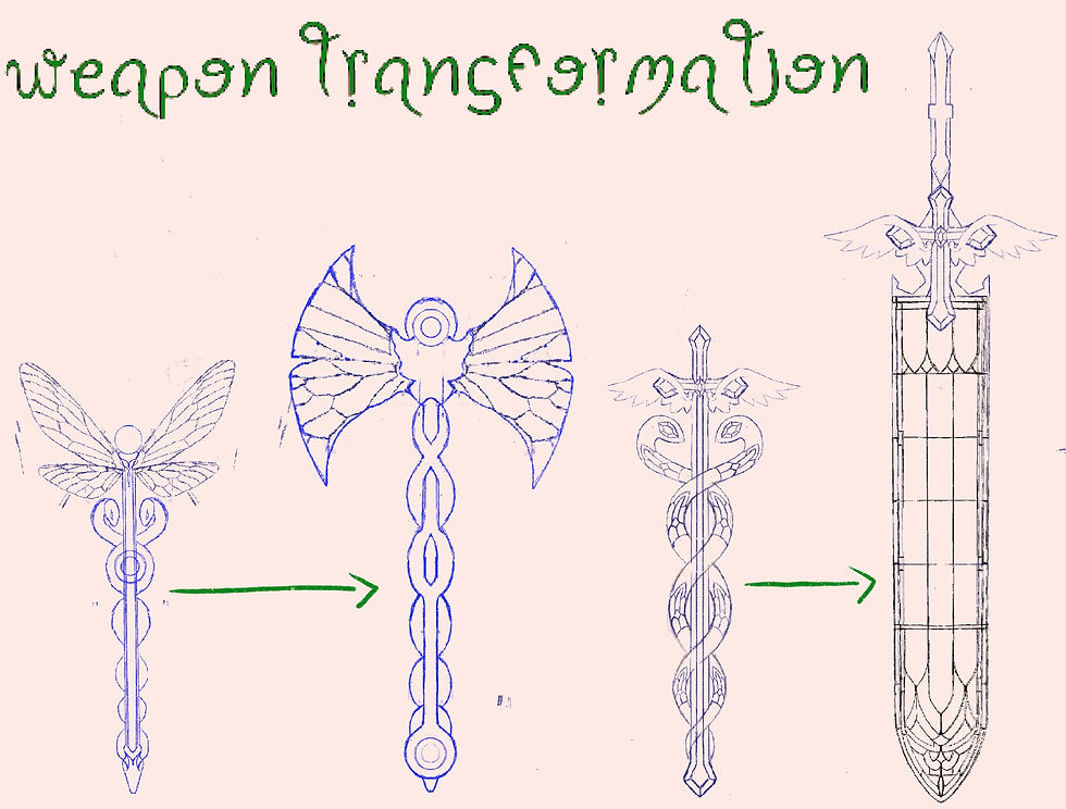
This is just showing how each weapon transforms each weapon will keep the overall design of the stuff in mind so I staff will not just turn it into a random axe, instead nstead, the dragonfly staff will turn into a dragonfly I axe.
these are just showing examples of the weapon animations I would like. I think it would be cute idea for each weapon to have some sort of personality, or at least react to things are happening. I think it would be cute for the chain whip to hide its face during intense parts of the game when you encounter a scary monster, but then in battle, the wings would often on the years would turn upwards. I think another cool element of having weapon on mission is that the wings would be able to make each weapon return to you after it has been thrown saw a bat is considered a melee weapon, but after a certain amount of time you can get a scale to throw the box for distances, and I have a fly back to you, so essentially turning the bat into a long distance weapon also.

Mini boss
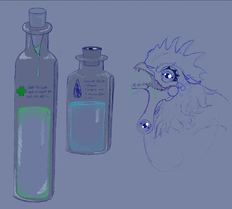
In the game after you have spoken to Hermes, and done some training with him you'll be able to face off against a mini boss. This mini boss would be a cockatric, cockatrices, have the ability to freeze people with their gaze. They are also poisonous and incredibly dangerous, and the myths that they are depicted in although it is dangerous I think it would be a good start as a mini boss, as it is small and not too threatening, but still a challenge feeding this mini boss entails that you managed to extract poison from its teeth. This poison can be turned into an antidote that will help you heal faster during future battles. I wanted to draw the cockatrice having four eyes instead of just 22 were there I should be, and then to all the eyes attached to its wattels (them dangly things under it's beak bleh) how to research the cockatrice it does seem very powerful, but I think giving it to ability to only be able to freeze the player rather than send them completely to Stone a kin to Medusa would be able to do. I also gave it lots of teeth and and a wide mouth I wanted it to have some fear factor to it rather than just be a chicken with a serpents tail.

This is where you Collect two potions that will help you progress through the game and beat further more challenging monsters. You are able to run out of each potion though so you would have to use them sparingly. The cockatrice is said to have healing properties, and also eyes that can freeze victims. I thought it would be cool to integrate this aspect of theKid so you can get in portions from defeating it. By collecting one of the cockatrices fangs, you can create a healing potion that will add you and future. You can also collect the cockatrices to use that will create a portion that can freeze your enemy for a short amount of time.
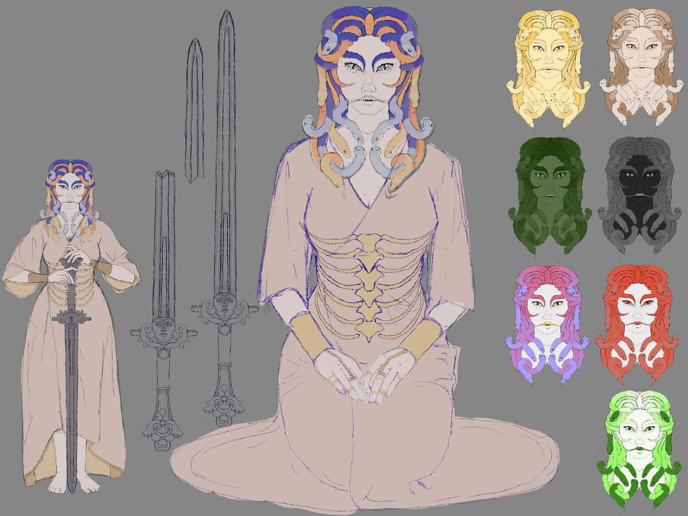
Midi boss
Here are some consept ideas for the middle boss Medusa. I didn't know whether to give her a very snakelike face or more human face, and then I chose to give her more human face.Even though I do like the snake scaled face idea also. Her eyebrows are represented by the tales of two snacks. I wanted details of the snakes to twist and move, depending on her emotions, imitating what her eyebrows would be like.I don't know if I managed to show this through concept sketches they just like normal eyebrows or patterns on her facebut if I was the better actualize, this idea, I would make it more clear that the eyebrows a part of a snake hair. Medusa is known for her power of turning people to stone just by looking at them, I had to think of a way to integrate this into a gear mechanic as I want to play to be able to see medusa and dodge attacks from her and have some sort of hand to hand combat with her I had to think of a way that the plywood be able to look at her without turning to Stone. One of my first ideas was that you could obtain a portion from Hermes that would help you you could drink and be mean to her gaze for a certain amount of time. I don't like this idea as med Medusa, seem week. My other idea was to have her have a third eye that she opens and that is the one that continue to stone that way you can look at her and fight her and only sometimes would have to turn away from her. I thought it might be a little bit boring just giving her a third eye that would open in Claus also from a distance, it would be hard to see a small eye on her for head. This will make it hard for the player to know when she was about to turn to Stone. I don't thought she could have.Portal of some sort that would make an IP or in the center this way from a distance you would be able to see when she was about to activate her power. I also think it's a cool design choice.

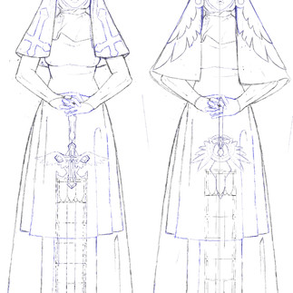
Medusa isn't typically depicted with a weapon, but I wanted to give her a weapon so that she can throw it at the player, long distances weapon (throwing knives) and a weapon that she could use in close combat with the player (sword) . So I gave her to throw knives on the stone sword. I'm happy with the design of both of her weapons I particularly like the throwing knives. To give her some extra fear factor, I gave her a white snake like mouth. I didn't draw these contacts out, but I had the idea that she would be able to unhinge her jaw similar to how snake or something creepy like that. All the snake elements that I've given to Medusa I chain rings that are supposed to look like a snake spine and also a snake skeleton belt made from gold. I wanted to give her a simple dress as she has a lot going on with her color palette and her design so I didn't want to overpower the design by giving her a complex colorful dress/Robe.
I would like medusa to have two different phases one where she's using throwing knives enough to defeat her and get close to her she could have a stone sword. This will be the second phase will you fight Hunter hand with her as you were close now she wouldn't be able to activate her power of turning it to stone, but instead would be fighting you with a sword. I had a lot of fun design in his sword. I went to look at gargoyles and stone architecture for the handle. I enjoyed looking at the patterns and ships of stone architecture in integrating that into a sword design. I like the idea that she turned a night or worry to stone, and then took this word after that turned to stone. After you defeat medusa, the sword would break that would be the thing that her and he said to ask you to deliver back to him or it could be a cool collectible something of that sort.
Main boss

The thing I am happy with most this project is that I was able to create a 3-D design to help me draw. I feel like I work better in 3-D although I wasn't be able to finish the body. I'm relatively happy with the head considering it is my second try sculpting a normal sculpt I don't think I did too bad I still need to practice three forms and I wish I studied a dog women's had a little bit better. I was looking at it now his muzzle look slightly short, but other than that I'm happy with this design.

These are some color concepts for Cerberus at the top or more natural color palettes that Doberman dogs have in real life and at the bottom or more fantastical unrealistic color palettes.

This is the idea I had for Cerberus is litter. It would be an underground cave with the roots, representing how dogs, dig underground and buried their bones and toys. I thought it would be cute to have the entrance filled with giant teddy bears with their heads ripped off and giant tennis balls, but I didn't have time to ask you this idea. I really like the silhouette of Cerberus I don't think it immediately read that there is three different has rather it just looks like one on this creature I like the idea of servers coming into the lights and having the reveal that this is in fact, Cerberus, and then you get the mission notification to defeat Cerberus after he has been revealed.

Thinking of how to make a bottle, more exciting, and the impacts feel more serious. I thought the screen could change color for each hit more vital hits would have a flash of red come up on the screen. The green flash would mean that you were close to beating Cerberus on an orange flash could represent. That the life bar is getting low. I wish I draw my life bar at the bottom of the indication of how much hits you can take, but I forgot to add it. I wouldn't want the flashes to be two consecutive is this could be an issue for people with epilepsy or sensitivities to things like that.
I like the idea that Hermes tasks you with collecting some thing from each boss that you defeat, for example, the potions from the cockatrice medusa sword, and the dog tag on Cerberus collar (which I have yet to draw)
I think this will give the game some satisfaction and make you feel accomplished when you defeat a boss. After defeating boss, you obviously progress through the game, which will give you a sense of accomplishment and incentivize you to keep playing but also I like the idea of getting collectibles.
Cerberus 3-D model nomad sculpt
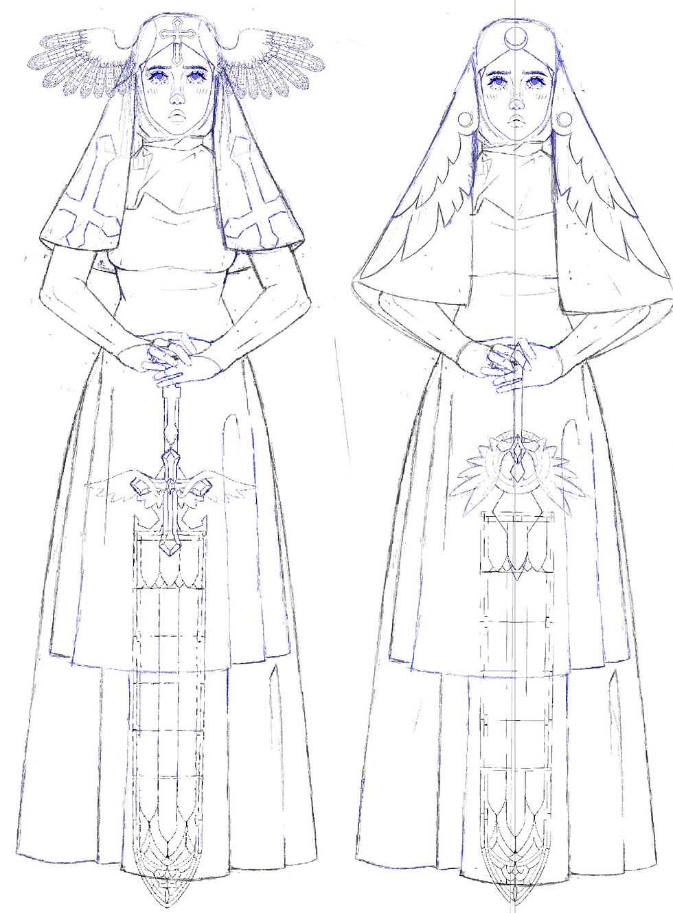
These are two concept, design ideas for the character representing thievesHad the idea of giving her Stainglass wings on the stain glass sword but in the end, I merge these two ideas together, giving head of wings instead as I feel that stain glass wings on her head over complicated the designit would be an interesting skin to have as an option to pay for the game or something like that.But I like her simpler design better.
This is a concept, sketch for the character representing commerce I knew from the start I wanted to give her two weapons that were barbecue tongs, inspired by the weapon and killer kill they would split the pot and become two different weapons that she could do dual wield.

Before the initial design of Cerberus with connected mouths, I thought it would be an interesting idea to have his heads still have the bottom jaw and be able to close and open them in the end I didn't go with this idea as I liked my connected Miles design more as it was more creepy and interesting to look at. The task I gave myself on creating the cards design for Cerberus was to try and create a three headed dog without just giving it three heads. of giving him a snack, like body for each head that is wrapped around each other as in some myths Cerberus is said to have serpent light features, so I think that would link well with that aspect of him. I also had an idea of keeping him with one head, but with the features of three different dogs.I do like this idea although I don't think it would really read as Cerberus.

I don't have a lot of concept, sketches, or ideas for this project as I didn't have time to refine my ideas and went with the first idea that I had with all my characters except one or two, are the first ideas I had, and looking back I could've executed them in a more creative way I do like most of my character designs for I think they're kind of charming I just with I could have shown them clearer.
If I was to do this project again I would worry less about having each character finished. And I would have given myself less work as then I would have been able to refine my drawings and characters more. I feel like less would have been more with this project, I had way to many ideas that I tried to get down and add in a short amount of time. I am aware that working in an industry such as game design you will have to work fast and be able to show your ideas when needed for deadlines. I found it hard this


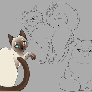
Some drawings I did for my friends game she wanted 3 cats with specific personalities to show through in their designs. One cat needed to look crazy and in hinged one needed to look snooty and the one in the middle needed to look nervous. I think I did an okay job considering she needed the designs in around a day or 2.

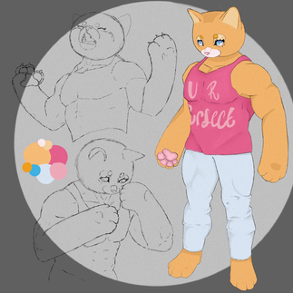
My DnD character Mr pUrrfect


Comments